What is this post about?
The urgent need to address climate change implies that we should all act to communicate and confront this existential risk. However, the enormous amount of climate data can be daunting for non-experts such as myself to navigate. What data should we be looking at? Where can I find them? In 2008 Professor Stefan Rahmstorf presented what he considered The 5 Most Important Data Sets of Climate Science. Recently I came across a post on the Open Mind blog where the author updated these data sets through the present and examined their evolution since 2008. However, it wasn’t immediately clear where to find this data and track it over time.
The post sparked the idea of reproducing these five charts in R, using ggplot2 to create crisp graphs, and make the source of the data and process fully reproducible. This could make it easier for others to also share this data. The code to generate each of these five important charts is below. I rely on basic tidyverse libraries as well as the patchwork package to generate the mosaic chart at the end. I plan to periodically update these charts to keep them up to date, and add additional data sets and graphs over time. I hope you find this useful and welcome your comments.
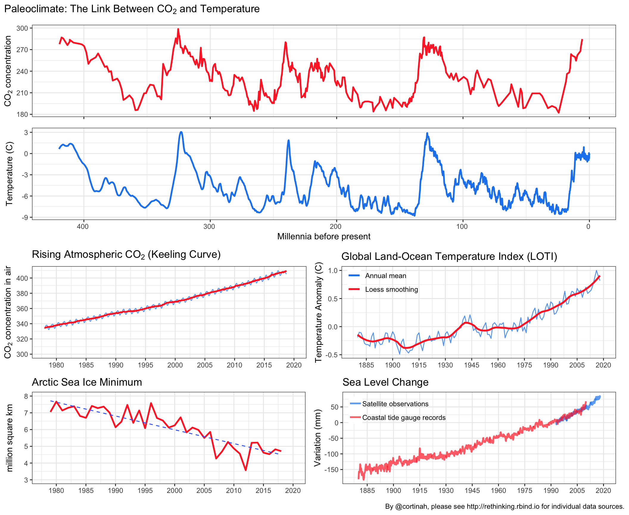
Data Set #1: The Link Between Temperature and Atmospheric CO2
library(tidyverse)
library(patchwork)
library(lubridate)
library(zoo)


file_url <- 'http://cdiac.ess-dive.lbl.gov/ftp/trends/co2/vostok.icecore.co2'
download.file(file_url,'vostok.txt')
vostok <- read_table2("vostok.txt", col_names = FALSE, skip = 21)
colnames(vostok) <- c('depth','age_ice','age_air','co2')

file_url <- 'http://cdiac.ess-dive.lbl.gov/ftp/trends/temp/vostok/vostok.1999.temp.dat'
download.file(file_url,'paleotemp.txt')
paleotemp <- read_table2("paleotemp.txt", col_names = FALSE, skip = 60)
colnames(paleotemp) <- c('depth','age_ice','deuterium','temp')

theme_set(theme_bw(base_size = 14))

a <- ggplot(vostok,aes(x=age_ice,y=co2)) +geom_line(size=1, col='firebrick1') +scale_x_reverse(lim=c(420000,0)) +
  theme(axis.title.x=element_blank(), axis.text.x=element_blank()) +labs(y=expression(CO[2]*' concentration' ))

b <- ggplot(paleotemp,aes(x=age_ice,y=temp)) +geom_line(aes(y=rollmean(temp, 8, na.pad=TRUE)), size=1, col='dodgerblue2') +scale_x_reverse(lim=c(420000,0),
            labels = scales::unit_format(unit='',scale = 1e-3)) +labs(x='Millennia before present',
            y='Temperature (C)')

(c <- a / b + plot_annotation(title = expression('Paleoclimate: The Link Between '*CO[2]*' and Temperature'), caption = 'Source: Carbon Dioxide Information Analysis Center (CDIAC)\nhttp://cdiac.ess-dive.lbl.gov/trends/co2/vostok.html',
      subtitle='420,000 years from the Vostok ice core, Antarctica.', theme = theme(  plot.title = element_text(size = 20))))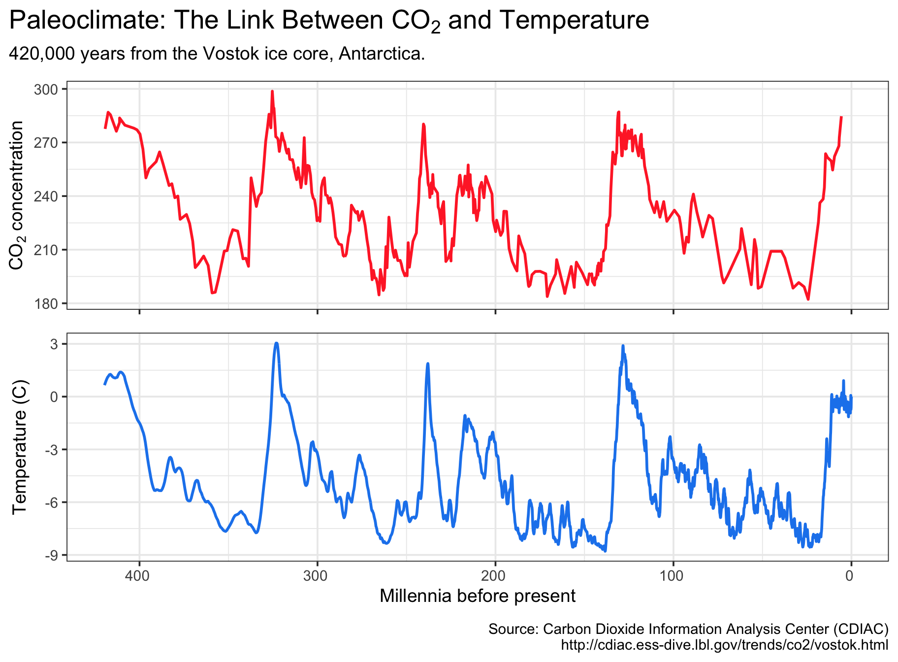
Data Set #2: The Anthropogenic Rise in CO2 Concentration
file_url <- 'ftp://aftp.cmdl.noaa.gov/products/trends/co2/co2_mm_mlo.txt'
download.file(file_url,'maunaloa.txt')
maunaloa <- read_table2("maunaloa.txt", col_names = FALSE, skip = 72)
colnames(maunaloa) <- c('year', 'month', 'date', 'average', 'interpolated', 'trend','days')
maunaloa$date <- as.Date(as.yearmon(paste(maunaloa$year, maunaloa$month, sep='-')))

(d <- ggplot(maunaloa, aes(x=date, y=average)) +geom_line(color='dodgerblue2', alpha=0.7) +
  scale_x_date(name=NULL, date_breaks='10 years', lim=c(ymd('1963-01-01'), ymd('2020-01-01')), date_labels='%Y') +scale_y_continuous(lim=c(300, 410), breaks=seq(300, 400, 20)) +
  geom_line(aes(y=trend), size=1, col='firebrick1') +labs(title=expression('Rising Atmospheric '*CO[2]*' (Keeling Curve)'), subtitle=expression('Mauna Loa '*CO[2]*' monthly mean ppm'),
  y=expression(CO[2]*' concentration in air' ), caption='Source: NOAA/ESRL and Scripps Institution of Oceanography.\nhttps://www.esrl.noaa.gov/gmd/ccgg/trends/data.html'))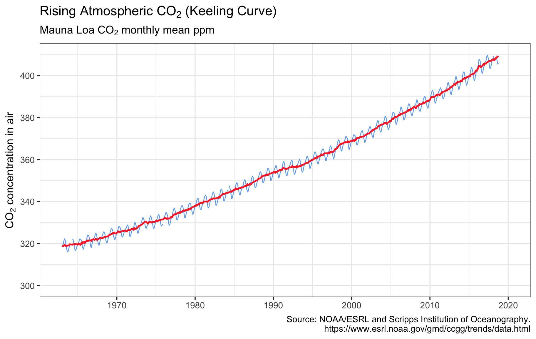
Data Set #3: Rising Global Temperatures…
file_url <- 'https://data.giss.nasa.gov/gistemp/tabledata_v3/GLB.Ts+dSST.csv'
download.file(file_url,'gisstemp.csv')
gisstemp <- read_csv("gisstemp.csv", skip=1, na='***')
gisstemp[nrow(gisstemp), 14] <- mean(as.numeric(gisstemp[nrow(gisstemp), 2:13]), na.rm = T)
gisstemp <- gisstemp[ , c('Year', 'J-D')]
colnames(gisstemp) <- c('date', 'annmean')
gisstemp$date <- as.Date(as.yearmon(gisstemp$date))
gisstemp$annmean <- as.numeric(gisstemp$annmean)

(e <- ggplot(gisstemp, aes(x=date, y=annmean)) +geom_line(alpha=0.75, aes(color='Annual mean')) +
  scale_x_date(name=NULL, lim=c(as.Date('1878-01-01'),as.Date('2020-01-01')), date_breaks='15 years', date_labels='%Y') +
  scale_y_continuous() +geom_smooth(size=1.1, se=F, span=0.2, aes(color='Loess smoothing')) +
  labs(title='Global Land-Ocean Temperature Index (LOTI)', subtitle='Global surface temperature relative to 1951-1980 average',
  y='Temperature Anomaly (C)', caption='Source: NASA Goddard Institute for Space Studies\nhttps://data.giss.nasa.gov/gistemp/') +
  scale_color_manual(name=NULL, values=c('dodgerblue2','firebrick1')) +theme(legend.position = c(0.15,0.85),legend.background=element_blank()))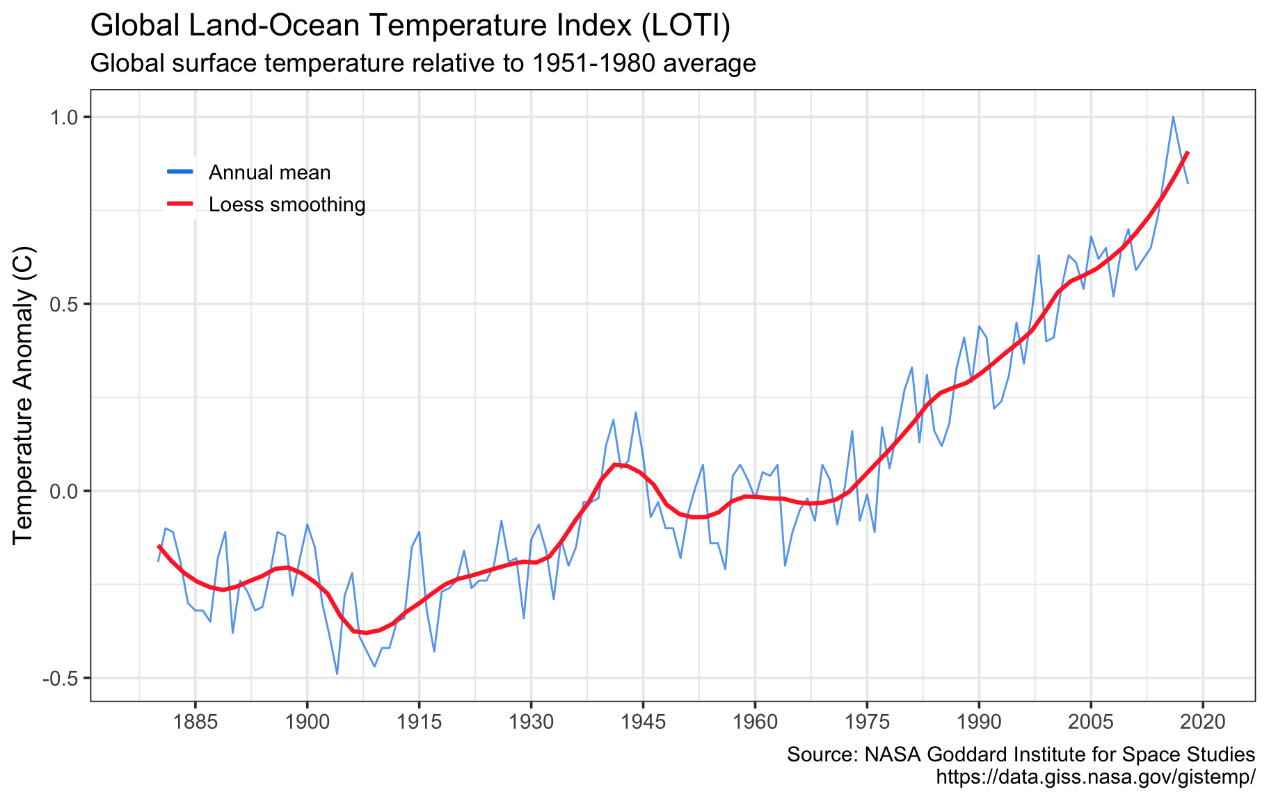
Data Set #4: …And the Rising Sea Level
file_url <- 'http://sealevel.colorado.edu/files/2018_rel1/sl_ns_global.txt'
download.file(file_url,'gmsl_sat.csv')
gmsl_sat <- read_table2("gmsl_sat.csv", col_names = FALSE, skip = 1)
colnames(gmsl_sat) <- c('date','gmsl_sat')
gmsl_sat$date <- round_date(date_decimal(gmsl_sat$date),'day')


file_url <- 'http://www.cmar.csiro.au/sealevel/downloads/church_white_gmsl_2011.zip'
download.file(file_url,'gmsl_tide.zip')
unzip('gmsl_tide.zip', 'CSIRO_Recons_gmsl_mo_2011.csv', overwrite = T)
gmsl_tide <- read_csv("CSIRO_Recons_gmsl_mo_2011.csv", col_types = cols(`GMSL uncertainty (mm)` = col_skip()))
colnames(gmsl_tide) <- c('date', 'gmsl_tide')
gmsl_tide$date <- round_date(date_decimal(gmsl_tide$date),'day')

gmsl <- full_join(gmsl_tide, gmsl_sat); rm(gmsl_sat, gmsl_tide)

diff <- gmsl %>% filter(date>as.Date('1993-01-01') & date<as.Date('1994-01-01')) %>% summarize_all(funs(mean=mean), na.rm=T)
diff <- diff$gmsl_tide_mean-diff$gmsl_sat_mean
gmsl$gmsl_sat <- gmsl$gmsl_sat + diff

gmsl <- gather(gmsl, key=method, value=gmsl, -date, na.rm=T)

(f <- ggplot(gmsl, aes(x=date,color=method,y=gmsl)) +geom_line(alpha=0.7,size=1) +
  scale_x_datetime(name=NULL, breaks='15 years', lim=c(ymd_hms('1878-01-01 00:00:00'), ymd_hms('2020-01-01 00:00:00')), date_labels ='%Y') +
  scale_color_manual(values=c('dodgerblue2','firebrick1'),labels=c('Satellite observations','Coastal tide gauge records')) +theme(legend.position = c(0.20,0.80),legend.background=element_blank(),legend.title = element_blank()) +
  scale_y_continuous(breaks=seq(-200,75,25)) +
  labs(title='Sea Level Change', subtitle='Tide gauges: 1880-2009; Satellite: 1992-2018, calibrated to 1993 tide gauge average.', y='Variation (mm)', caption='Sources: University of Colorado Sea Level Research Group (sat)\nhttp://sealevel.colorado.edu/\nCSIRO (tide gauge)\nhttp://www.cmar.csiro.au/sealevel/sl_data_cmar.html'))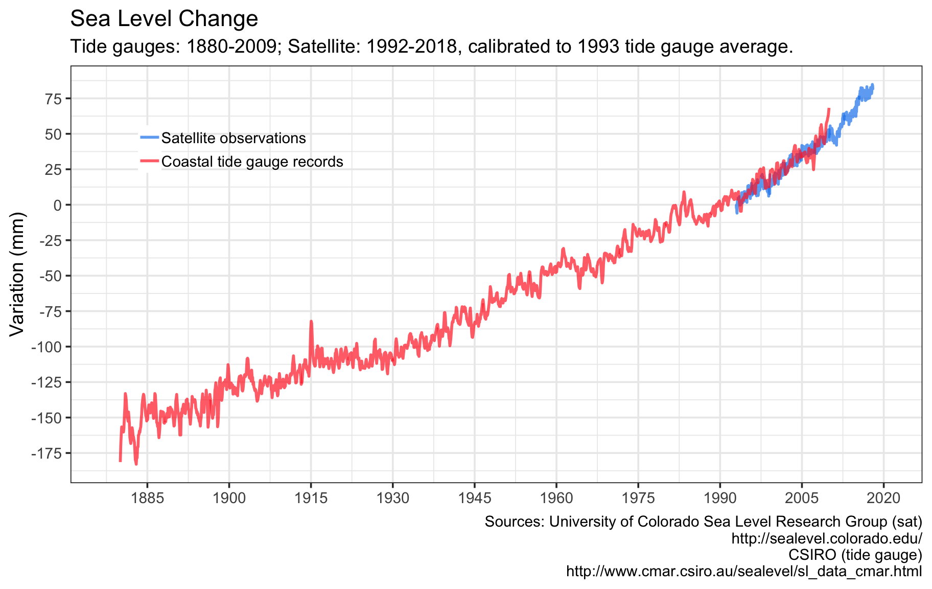
Data Set #5: Polar Sea Ice in Retreat
file_url <- 'ftp://sidads.colorado.edu/DATASETS/NOAA/G02135/north/monthly/data/N_09_extent_v3.0.csv'
download.file(file_url, 'arctic_ice_min.csv')
arctic_ice_min <- read_csv("arctic_ice_min.csv")
arctic_ice_min$year <- round_date(date_decimal(arctic_ice_min$year), 'year')

(g <- ggplot(arctic_ice_min,aes(x=year, y=extent)) +geom_line(size=1, color='firebrick1') +
  scale_x_datetime(name=NULL, breaks='5 years', date_labels='%Y', lim=c(ymd_hms('1978-01-01 00:00:00'), ymd_hms('2020-01-01 00:00:00'))) +
  scale_y_continuous(lim=c(3,8)) + geom_smooth(method='lm', se=F, linetype=2, size=0.5) +
  labs(title='Arctic Sea Ice Minimum', subtitle='September average sea ice extent. Linear regression line in blue.', y='million square km', caption='Source: National Snow & Ice Data Center\nhttps://nsidc.org/data/seaice_index\nftp://sidads.colorado.edu/DATASETS/NOAA/G02135/north/monthly/data/N_09_extent_v3.0.csv'))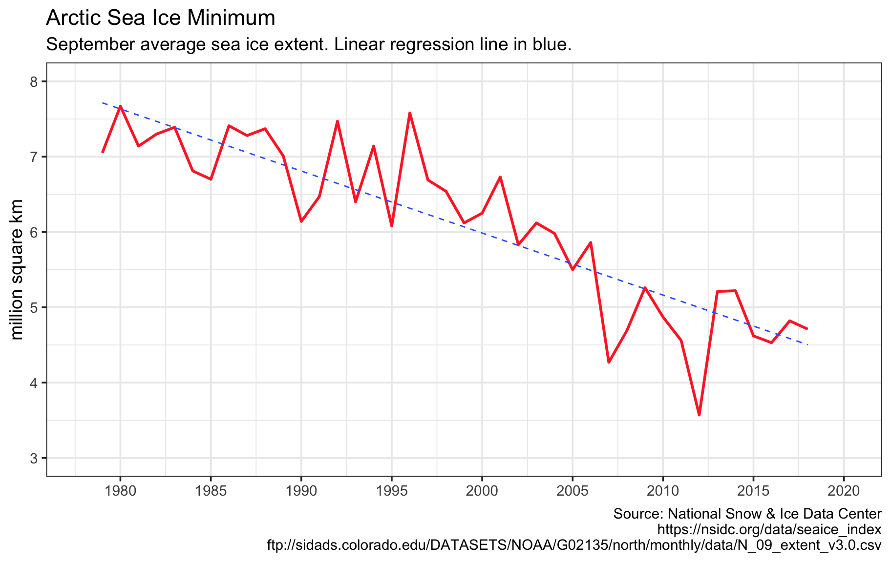
Pulling it all together with patchwork
The Top Five Climate Data Sets