Background to this post: rstudio::conf 2019
I had the wonderful opportunity to attend RStudio’s annual conference in Austin, Texas last week, supported by a generous grant from RStudio. While I can’t possibly write about all of the incredible people I met and the excellent presentations I saw, I’d like to share some of what I learned through a pair of blog posts, the first one focused on the new time-series infrastructure “tidyverts” of tidy R packages for time series analysis. The second will be on the machine learning workshop I attended. The tidyverts effort is led by Rob Hyndman and a team of highly skilled R statisticians. Earo Wang gave a lively and informative presentation regarding the tsibble package, which introduces a new class of tidy time series objects, as well as the fable package which will in due course include all of the time series models from the forecast package. While tsibble is currently on CRAN, fable is at an earlier stage of development and only available on github. Earo’s great talk inspired me to try out the packages using a dataset of temperature data that has been consistently gathered at Kremsmünster Abbey in Austria since the late eighteenth century. It’s considered to be one of the highest quality long-running instrumental temperature records, and provides in my opinion some startling evidence of how anthropogenic climate change has already had a major impact. It also provides an opportunity to try out the tidyverts packages.
Introduction: The instrumental climate record
I became aware of the Kremsmünster temperature data through this blog post by Tamino, a climate scientist I frequently read. In that post Tamino visualized the Kremsmünster data, and I thought it would be great to attempt to replicate that analysis, add some ggplot goodness, run some forecasts, and post the code to make it replicable. Note that I am not a climate scientist and the forecasts are only here to try out the fable package, and certainly don’t incorporate any atmospheric climate modeling. Here is a helpful academic reference (Böhm 2009) which provides much detail on Kremsmünster, and notes that “The original measuring site at the NNE-facing wall of the astronomical tower of the Benedictine monastery in Upper Austria is trustworthy and reported to be unchanged from the start of the record in March 1767 until now”. Unfortunately, I was not able to obtain the data going back to 1767, but through the European Climate Assessment & Dataset project, daily temperatures going back to 1876 can be downloaded. This is long enough to allow us to see the worrying changes in the climate that are taking place. ECA&D provide the data in two large .zip files (one for daily high and the other for the daily low) that include hundreds of monitoring stations. The R code below shows how to extract the Kremsmünster data from the two large ECA&D .zip files.
 Kremsmünster Abbey, Austria
Exploring climate change: rising temperature anomalies, fewer freezing days, and more hot days
Load packages, install fable if needed
This section loads the required CRAN packages and installs fable from github.
library(tsibble)
library(tidyverse)
library(lubridate)
library(magrittr)
library(patchwork)
if (!'fable' %in% installed.packages())
   devtools::install_github("tidyverts/fable")
library(fable)
Download ECA&D daily max and daily min temperature datasets
This section downloads the temperature zip files and extracts the Kremsmünster data. Unfortunately it will be slow the first time it is run due to the large (775 Mb total) files.
mintempfile <- './data.ECAD/ECA_blend_tn/TN_STAID000011.txt'
fileURL <- 'https://www.ecad.eu//utils/downloadfile.php?file=download/ECA_blend_tn.zip'

if (!file.exists(mintempfile)) {
    download.file(fileURL, destfile="./ECA_blend_tn.zip", method="auto")
    unzip('ECA_blend_tn.zip', files='TN_STAID000011.txt', exdir='./data.ECAD/ECA_blend_tn/') }

maxtempfile <- './data.ECAD/ECA_blend_tx/TX_STAID000011.txt'
fileURL <- 'https://www.ecad.eu//utils/downloadfile.php?file=download/ECA_blend_tx.zip'

if (!file.exists(maxtempfile)) {
    download.file(fileURL, destfile="./ECA_blend_tx.zip", method="auto")
    unzip('ECA_blend_tx.zip', files='TX_STAID000011.txt', exdir='./data.ECAD/ECA_blend_tx/') }
Wrangle temperatures into tsibbles and add daily mean
This chunk extracts the needed columns from the files, removes missing or “suspect” quality observations based on codes provided, converts temperatures to degrees Celsius, and creates the tsibbles. We plot a recent subset of the data as a check.
raw <- read_csv('./data.ECAD/ECA_blend_tn/TN_STAID000011.txt', skip=20)
raw %<>% select(-STAID, -SOUID) %>% rename(date=DATE, min_temp=TN, qual=Q_TN)
raw %<>% mutate(min_temp = replace(min_temp, min_temp <= -9999, NA)) %>%
         mutate(min_temp = replace(min_temp, qual==1 | qual==9, NA))
raw %<>% mutate(min_temp = min_temp*0.1, date = ymd(date)) %>% select(-qual)
min_temp <- raw %>% as_tsibble(index=date)

raw <- read_csv('./data.ECAD/ECA_blend_tx/TX_STAID000011.txt', skip=20)
raw %<>% select(-STAID, -SOUID) %>% rename(date=DATE, max_temp=TX, qual=Q_TX)
raw %<>% mutate(max_temp = replace(max_temp, max_temp <= -9999, NA)) %>%
         mutate(max_temp = replace(max_temp, qual==1 | qual==9, NA))
raw %<>% mutate(max_temp=max_temp*0.1, date = ymd(date)) %>% select(-qual)
max_temp <- raw %>% as_tsibble(index=date)

krem <- left_join(min_temp, max_temp)
rm(max_temp, min_temp, raw)

krem %<>% mutate(month = month(date), mean_temp = (max_temp + min_temp)/2 )

theme_set(theme_bw(base_size = 14))

ggplot(krem, aes(x=date, y=mean_temp)) +geom_line(alpha=0.8)  +
  scale_x_date('Year', limits=c(as.Date('2001-01-01'), as.Date('2019-01-01')), date_breaks='5 years', date_labels = "%Y") +
  scale_y_continuous('Mean Temperature ºC', limits=c(-20, 30), breaks=seq(-20, 30, 10))  +
  geom_smooth(size=1.2, color='orange') + geom_hline(yintercept=0,color='dodgerblue',linetype=2,size=1.5) +
  labs(title='Kremsmünster, Austria: 2001-2018 Daily Mean Temperature and Loess Trend', caption='Source: https://www.ecad.eu/')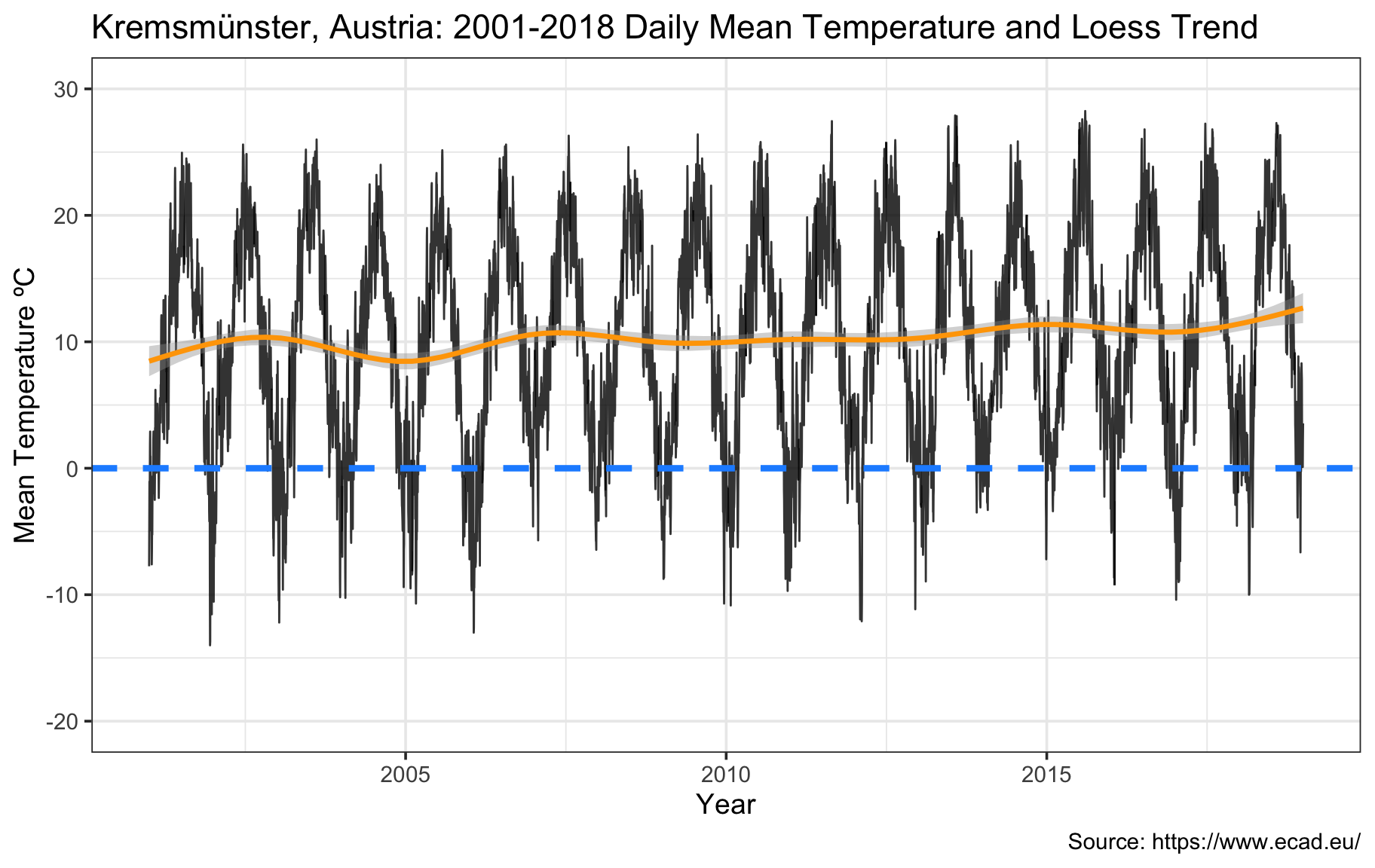
Visualize monthly temperature ranges for different periods
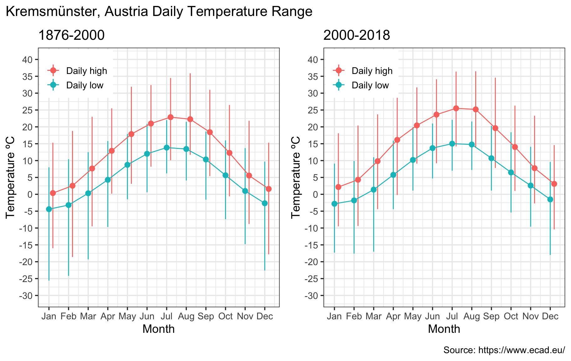
We start the EDA by looking at the range of daily highs/lows by month. First we look at the full 142 years, and below we break it down into the 1876-2000 and 2000-2018 periods. The overall seasonality looks as expected, but we can see that the winters in recent years have become less cold, and the summers warmer. While winter lows in the -25º to -20º C range occurred in the earlier period, more recent winter lows are near -15º. Furthermore, the daily high curve has shifted higher and 30º-35º degree highs are more common.
krem_narrow <- gather(krem, key='type', value='Temp', min_temp, max_temp, mean_temp) %>% as_tibble()
krem_range <- krem_narrow %>% group_by(type, month) %>% summarize(mean=mean(Temp,na.rm=T), max=max(Temp,na.rm=T), min=min(Temp,na.rm=T))
months <- c('Jan','Feb','Mar','Apr','May','Jun','Jul','Aug','Sep','Oct','Nov','Dec')

ggplot(krem_range, aes(x=month, y=mean, color=type)) +
  geom_pointrange(data=subset(krem_range, type=='min_temp'), aes(ymin=min, ymax=max)) +
  geom_pointrange(data=subset(krem_range, type=='max_temp'), aes(ymin=min, ymax=max), position=position_nudge(0.2)) +
  scale_x_continuous('Month',breaks=1:12,labels=months) +
  scale_y_continuous('Temperature ºC', breaks=seq(-25,35,5)) +scale_color_discrete(breaks=c('max_temp','min_temp'),labels=c('Daily high','Daily low')) +
  guides(color=guide_legend(title = "Range")) + theme(legend.position = c(0.12,0.88)) +
  geom_line(data=subset(krem_range, type=='min_temp')) +geom_line(data=subset(krem_range, type=='max_temp'), position=position_nudge(0.2)) +
  labs(title='Kremsmünster, Austria: 1876-2018 Temperature Range', caption='Source: https://www.ecad.eu/')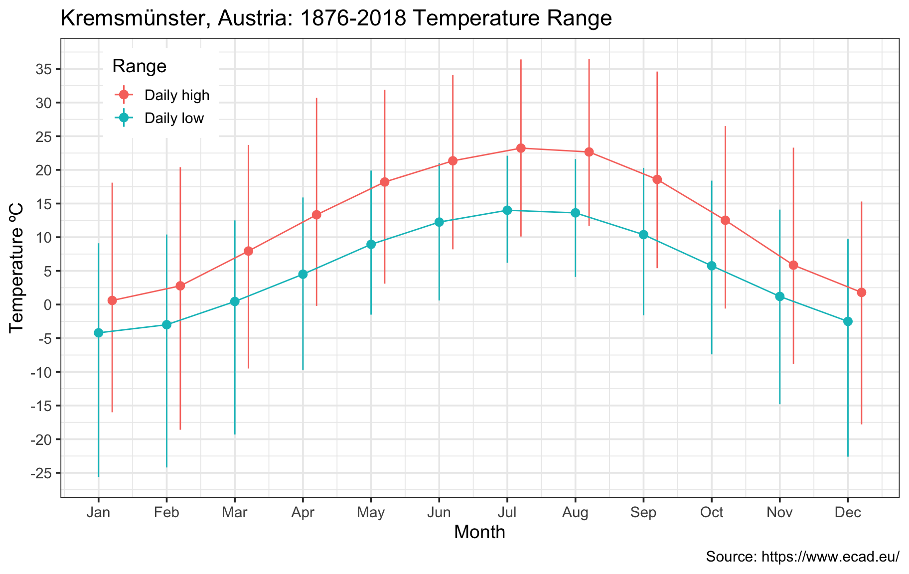
2.5º C temperature anomaly versus on 100-year average
Climate scientists frequently review temperature anomalies, defined as deviations vs a baseline period. Here we plot the annual average anomaly vs a 100-year baseline (1876-1976). We notice an upward trend since the 1970s, amounting to approximately 2.5º C in Kremsmünster at present.
krem_narrow %<>% mutate(day=yday(date))
krem_range <- krem_narrow %>% filter(type=='mean_temp', date < as.Date('1976-01-01')) %>% group_by(day) %>% summarize(centurymean=mean(Temp, na.rm=T))

anomaly <- krem_narrow %>% filter(type=='mean_temp') %>% left_join(krem_range) %>% mutate(anomaly=Temp-centurymean) %>% select(date, anomaly)

anomaly %<>% mutate(year = year(date)) %>% as_tsibble(index=date) %>%
             index_by(year) %>% summarize(anom=mean(anomaly, na.rm=T))

ggplot(anomaly, aes(x=year, y=anom)) +geom_line(alpha=0.8)  +
  scale_x_continuous('Year', breaks=seq(1880, 2020, 20)) +
  scale_y_continuous('Temperature Anomaly ºC', limits=c(-2, 4), breaks=seq(-2, 4, 0.5))  +
  geom_smooth(size=1.5, color='red') + geom_hline(yintercept=0,color='dodgerblue',linetype=2,size=2) +
  labs(title='Kremsmünster, Austria: 1876-2018 Temperature Anomaly', subtitle = 'Baseline period: 1876-1976. Loess trend in red.',
          caption='Source: https://www.ecad.eu/')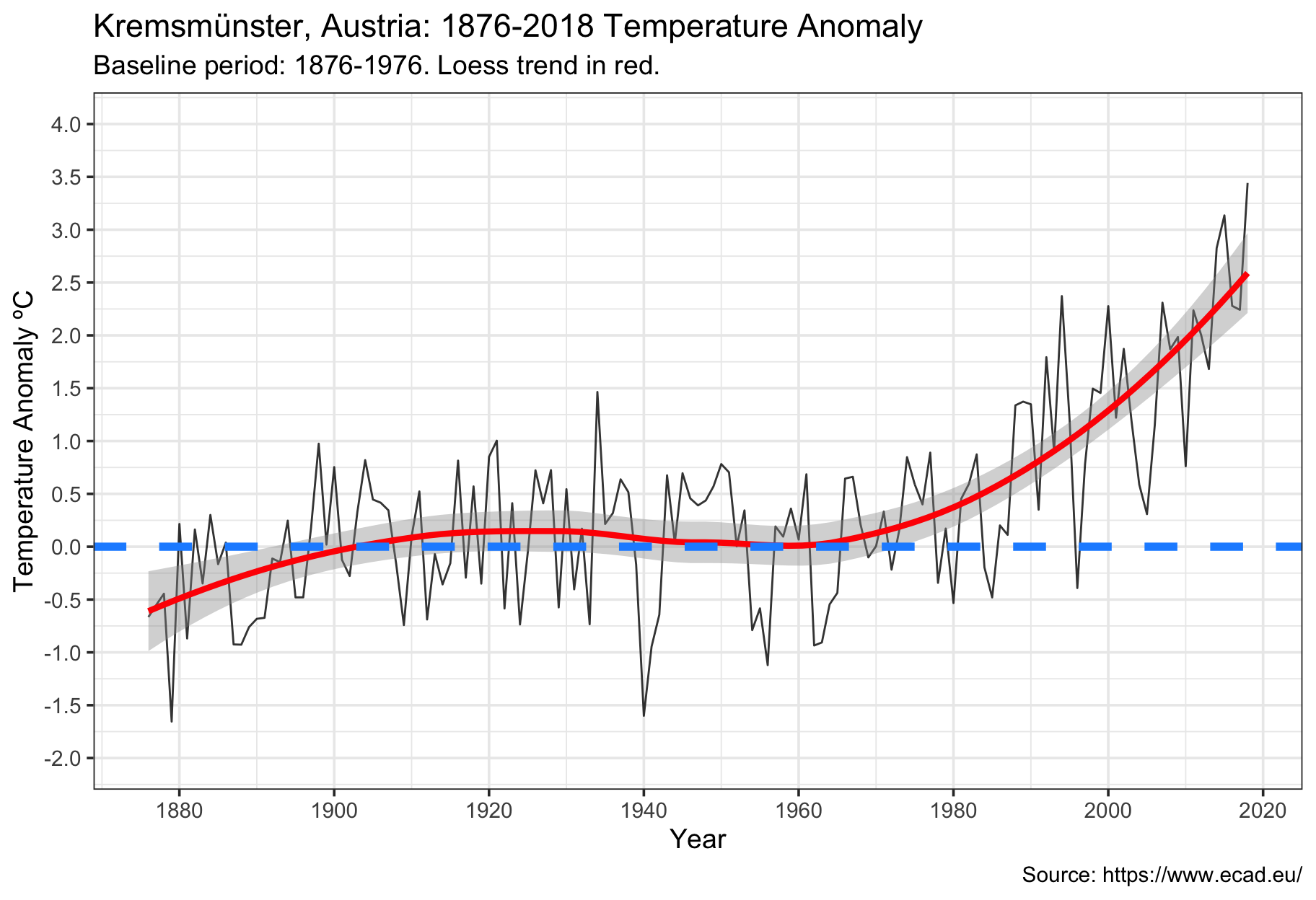
20-30 fewer below-zero days per year versus history
Here we count the number of below-zero mean temperature days per winter season (this spans the second half of one calendar year and first half of the next year). While Kremsmünster used to experience 60-70 below-zero days a year, that figure is now down to about 40 days.
krem_narrow %<>% mutate(year=year(date), winter=ifelse(month>6, 1, 0)) %>%
  mutate(year=year+winter) %>% select(-winter)
krem_high <- krem_narrow %>% filter(type=='max_temp') %>% select(date, Temp, year)
krem_narrow %<>% filter(type=='mean_temp') %>% select(date, Temp, year)

num_freeze_days <- krem_narrow %>% group_by(year) %>% filter(Temp<=0) %>% summarize(num_freezing=n())
num_freeze_days %<>% filter(year<=2018) %>% as_tsibble(index=year) %>% fill_na()

ggplot(num_freeze_days, aes(x=year, y=num_freezing)) +geom_line(alpha=0.8)  +
  scale_x_continuous('Year', breaks=seq(1880, 2020, 20)) +
  scale_y_continuous('Number of Freezing Days', limits=c(0, 110), breaks=seq(0, 110, 20))  +
  geom_smooth(size=1.5, color='dodgerblue') +
  labs(title='Kremsmünster, Austria: 1876-2017 Number of Freezing Days', subtitle = 'Number of days per year with daily mean temp < 0º C. Loess trend in blue.',
       caption='Source: https://www.ecad.eu/')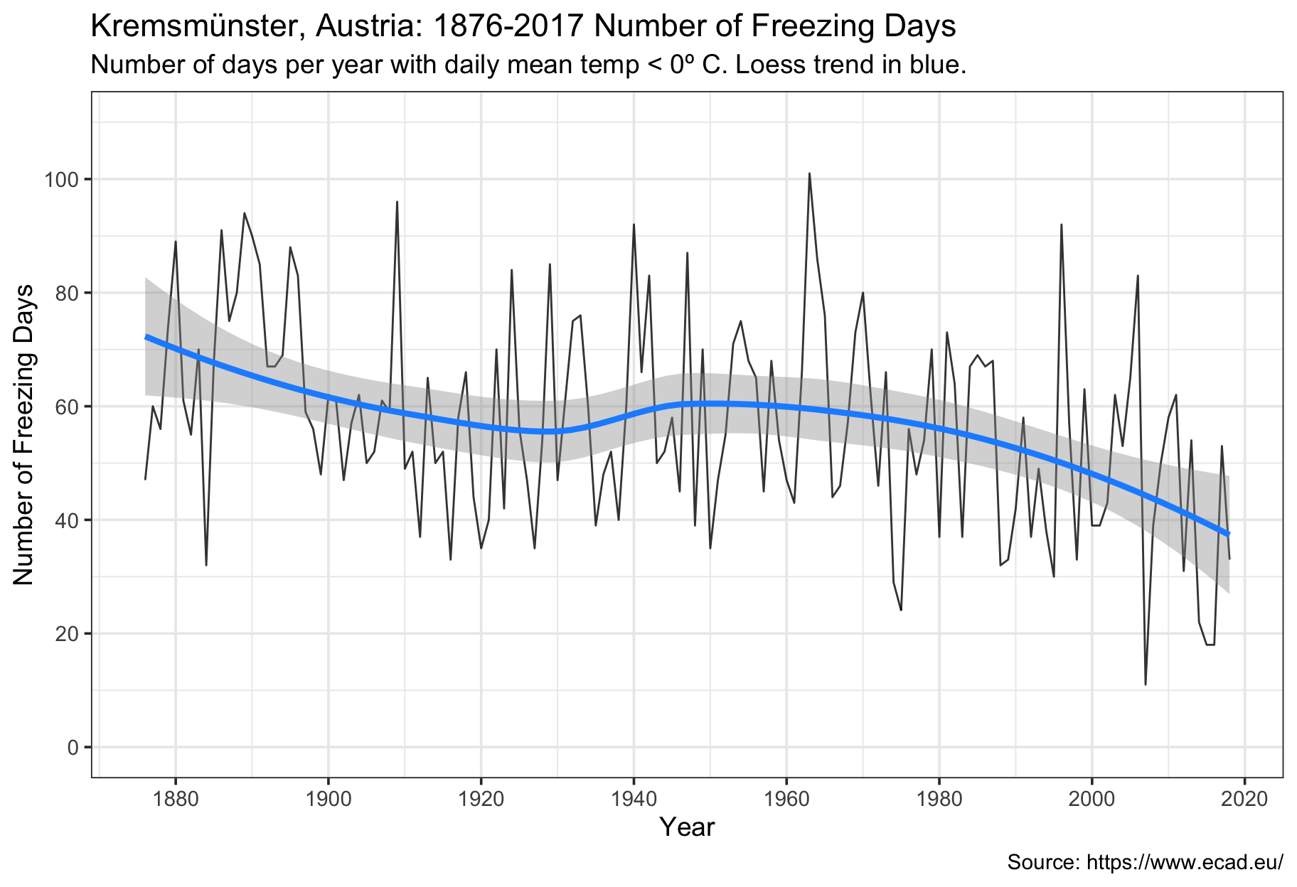
15-20 more hot (> 30º C) days a year
The converse is also true. Here we count the number of hot (> 30º high) temperature days per year. This has increased from being very rare (0-5 days a year in Kremsmünster) to now more common with 15-20 (or more) such days.
num_hot_days <- krem_high %>% group_by(year) %>% filter(Temp >= 30) %>%
                summarize(num_hot=n()) %>% as_tsibble(index=year) %>% fill_gaps() %>%
                replace_na(list(num_hot=0))

ggplot(num_hot_days, aes(x=year, y=num_hot)) +geom_line(alpha=0.7)  +
  scale_x_continuous('Year', breaks=seq(1880,2020,20)) +
  scale_y_continuous('Number of Hot Days', limits=c(0, 40), breaks=seq(0, 40, 10) , oob=scales::rescale_none)  +
  geom_smooth(size=1.5, color='red') +
  labs(title='Kremsmünster, Austria: 1876-2018 Number of Hot Days', subtitle = 'Number of days per year with daily high temp >= 30º C. Loess trend in red',
       caption='Source: https://www.ecad.eu/')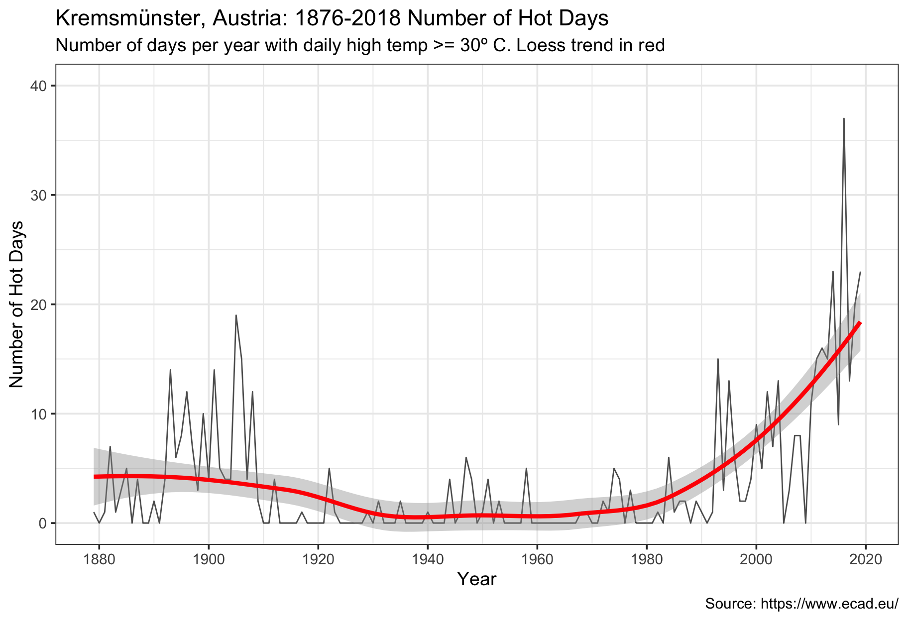
Annual cumulative “excess degrees” spiking
Last, before turning to the modeling with fable, we construct a metric of how hot it’s getting by plotting the cumulative sum of daily highs in excess of 30º C over the course of a year. This provides insight not only how many hot days a year there now are, but also the cumulative excess heat. While this figure was essentially zero through 1980, it has spiked remarkably in the last few years.
excess_degrees <- krem_high %>% mutate(excess_heat=ifelse(Temp-30 > 0, Temp-30, 0)) %>% group_by(year) %>% summarize(excess_degrees_total=sum(excess_heat)) %>%
                  as_tsibble(index=year) %>% fill_gaps() %>% replace_na(list(excess_degrees_total=0)) %>% filter(year<=2018)

ggplot(excess_degrees, aes(x=year, y=excess_degrees_total)) +geom_line(alpha=0.7)  +
  scale_x_continuous('Year', breaks=seq(1880, 2020, 20)) +
  scale_y_continuous('Annual Excess Degrees', limits=c(0, 140), breaks=seq(0, 140, 20), oob=scales::rescale_none) +
  geom_smooth(size=1.5, color='red') +
  labs(title="Kremsmünster, Austria: 1876-2018 Annual Sum of 'Excess Degree' Days", subtitle = 'Annual sum of (daily high - 30º C). Loess trend in red',
       caption='Source: https://www.ecad.eu/')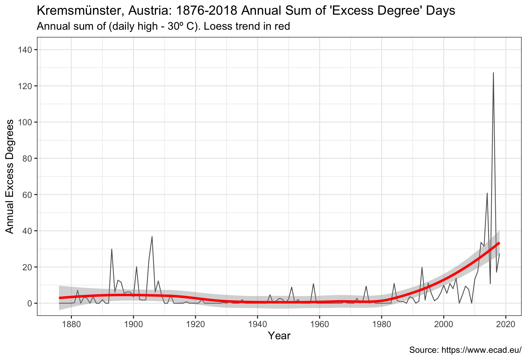
Forecasting with Fable
We now turn to the time series forecasts using fable. As shown, it’s quite straightforward to fit the model and extract forecasts and standard errors. I was not able to get the new geom_forecast(), which appears to do everything automatically to work, so I had to add an additional fortify step. This is not a major issue, and I’m sure it’s due to fable’s immaturity at this time.
Forecasting temperature anomaly with exponential smoothing (ETS) model
Fable currently implements Hyndman’s exponential smoothing (ETS) model and selects the optimal parameters. There are helper functions to extract all parameters, fitted values, errors, and forecasts. The 10-year forecast suggests the Kremsmünster temperature anomaly could be 3º within a decade.
anomaly_model <- anomaly %>% model(ets=ETS(anom))
anomaly_fbl <- anomaly_model %>%  forecast(h = "10 years")
anomaly_fbl <- fortify(anomaly_fbl,level=80)

p1 <- ggplot(anomaly, aes(x=year, y=anom)) +geom_line(alpha=0.8)  +
  scale_x_continuous('Year', breaks=seq(1880, 2020, 20)) + geom_hline(yintercept=0,linetype=2,color='dodgerblue',size=2)+
  scale_y_continuous('Temperature Anomaly ºC', limits=c(-2, 5), breaks=seq(-2, 5, 0.5))  +
  labs(title='Kremsmünster, Austria: 1876-2018 Temperature Anomaly', subtitle = '10-year ETS forecast in red, 80% confidence interval shaded.', caption='Source: https://www.ecad.eu/ Forecasts by @cortinah')

p1 + geom_smooth(aes(x=year, y=anom, ymax=upper, ymin=lower), size=1.5,
                 color='red', fill='dodgerblue', data=anomaly_fbl, stat='identity')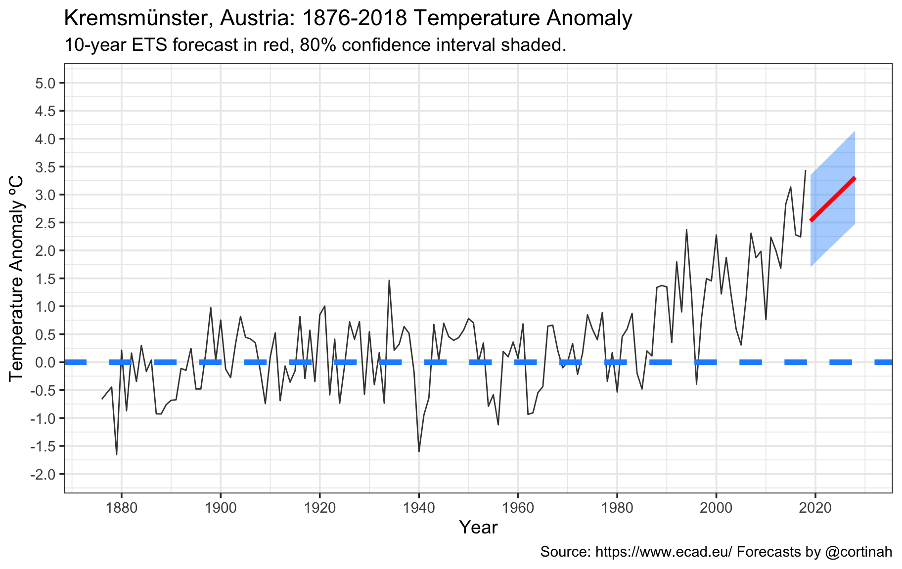
Forecasting number of hot days with a random walk model
As an illustration, switching to a simpler random walk (ARIMA) model with drift is as simple as changing the model() call. Here we take a naive look at how the number of hot days in Kremsmünster might evolve over the next decade.
hotday_model <- num_hot_days %>% model(ets=RW(num_hot ~ drift()))
hotday_fbl <- hotday_model %>%  forecast(h = "10 years")
hotday_fbl <- fortify(hotday_fbl,level=80)

p1 <- ggplot(num_hot_days, aes(x=year, y=num_hot)) +geom_line(alpha=0.7)  +
  scale_x_continuous('Year', breaks=seq(1880,2020,20)) +
  scale_y_continuous('Number of Hot Days', limits=c(0, 50), breaks=seq(0, 50, 10) , oob=scales::rescale_none)  +
  labs(title='Kremsmünster, Austria: 1876-2018 Number of Hot Days', subtitle = '10-year random walk forecast in red, 80% confidence interval shaded.', caption='Source: https://www.ecad.eu/ Forecasts by @cortinah')

p1 + geom_smooth(aes(x=year, y=num_hot, ymax=upper, ymin=lower), size=1.5,
                 color='red', fill='dodgerblue', data=hotday_fbl, stat='identity')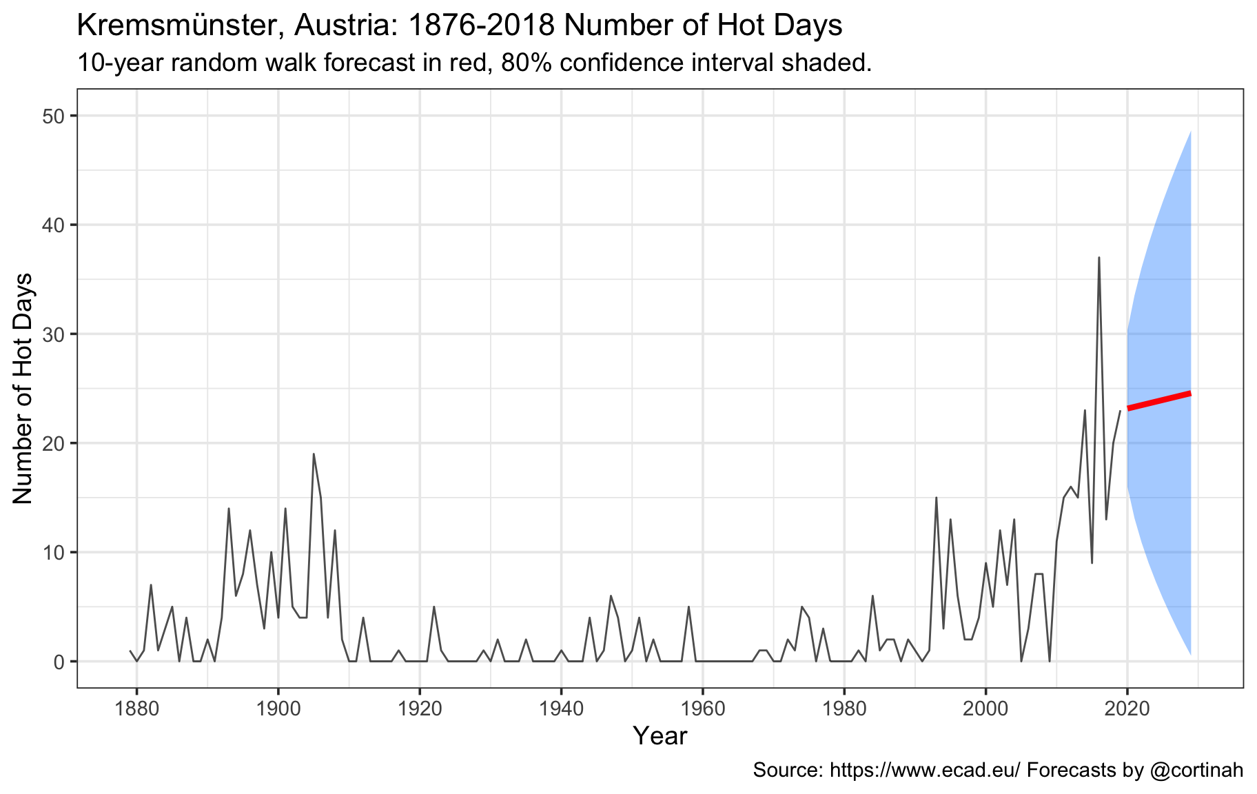
Thank you for reading!
If you got this far, thank you for reading and please don’t hesitate to send me your comments or suggestions. While this analysis pertains to only a single location, the conclusions I draw from this are unfortunately rather dispiriting, and reinforce the urgent need to act against catastrophic climate change.